
The Dreamcatchers is out and available now, so it is easy to miss all the work that went into bringing the final product into your hands. Since I’ve already written about my writing style and inspiration sources for The Dreamcatchers, I thought today that we might focus on the exterior. You know what they say: “You can’t judge a book by its cover!”
While they may be right – You can’t – it doesn’t mean that many people don’t. Creating a compelling book cover is important. It is nothing less than the reader’s first impression of your work. Some writers may be good illustrators (or at the very least graphic designers) but, for most of us, creating a good cover means stepping outside our comfort zone.
It is one of the first times we bring our work to someone else – Ask them to judge it – and then, even more disarmingly – Ask them to create something new from it. Lightning doesn’t always strike the first time either.
Let me take you through the book cover creation process for The Dreamcatchers:
Capturing the Right Tone
I’ve always loved reading fantasy. It is hands down my favorite genre to dive into. When I think of what intrigues me about this writing, it is the promise of impossible adventure. I am about to enter a world that isn’t my own, no matter how real it feels. But how do I pick which fantasy to read?
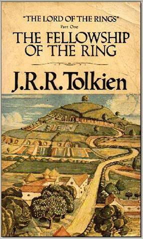
…I usually go by the cover. To me, the most intriguing books have cover designs that look like windows into the imagination. I always loved The Lord of the Rings‘ cover art. It provided an immediate visualization of Middle Earth:
So, when it came time for The Dreamcathers, naturally I wanted to do the same thing. This proved a challenge. Setting a story in dreams lends itself to some surreal imagery. Just choosing one dream felt too limited. I also didn’t want to use the world of the dreamcatchers, since I felt that, out of context, they would look too alien and sci-fi.
My publisher was also concerned about the audience. The Dreamcatchers contains frightening chapters and its core audience is in their teens. Perhaps something as family-friendly as Tolkien or J.K. Rowling wasn’t the best idea.
I was convinced to go more abstract – and I think it was the right decision. But, for any out there curious, I had a friend do a rough mock-up of my original Dreamcatchers cover design, and here it is:
The Essence of Story
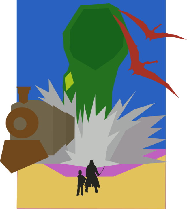
Being abstract posed its own challenges. While The Dreamcatchers is a fantasy, it is not the traditional one. There is no magic, no castles – instead, it is set primarily in a space-like realm filled with humanoid characters. Seeing the issue? Doesn’t that sound a little science-fiction-y? The early cover art definitely tended toward an outer space feel:

While this rough outline has some potential, I felt it was just too jarring. The colors evoked Mars more than anything ethereal and the hooded figure was too sinister (had we decided to work from this mock-up, the face would have been a difficult change). The planet and stars in the background are also out-of-place.
Overall, I was worried that someone looking at this cover would get the impression that The Dreamcatchers was a sci-fi horror story. Going a little more abstract didn’t help:

It became clear that my messaging was getting garbled. I wanted to show readers a new world – this was true. But it wasn’t a place they could reach in a space ship.
When you’re working with your illustrator, you must be clear. They’re busy people and likely yours isn’t the only project on their plate. This disconnect was being caused by a breakdown in communication. My illustrator, the Happy Writing Co., only understood half of what I wanted, so the illustrations fit this mold.
As author, I had to articulate the essence of The Dreamcatchers in a way that made sense. The right cover had to entice in a way that conveyed mystery, otherworldly experience and, above all, the surreal. At the same time, the reader needed an entry point. Vakarian, being a nefiri dreamcatcher, wasn’t the best person for the job.
So, it turned to Tony.
The Writer’s Gift of Communication
Writers may not always believe it, but we have a gift of communication. I’m not saying we’re all amazing speakers, but we possess the ability to put words to paper – and that’s pretty great. We also know our stories, inside and out. Remember that when dealing with your own publisher: No one knows your story better than you.
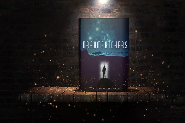
I didn’t want to focus on any one dream of Tony’s, but I wanted the idea of him dreaming to be conveyed on the cover. I also wanted the reader to know that where he was going wasn’t safe. At first, I think I went too heavy handed with my image suggestion. Together with Happy Writing Co., we settled on an initial idea:

As you can see, we hadn’t even bought the full image yet. We were still in testing with the mock-ups. Despite looking a bit alien-y, I knew we had a winner. It just needed some dressing. There needed to be something more:
And you know the rest. There are other designs that I didn’t show but hey, never reveal all the secrets, right?
The final result was incredible – a cover that entices and feels like something new, without going too far on the science fiction. I could not be more happy with how The Dreamcatchers‘ cover turned out. The Happy Writing Co. – who was unbelievably patient – did an amazing job and deserves the credit. They hit it out of the ballpark.
I hope this look inside The Dreamcatchers‘ cover selection process has been enlightening and given you some advice for when you pursue your own publication. Remember, illustrators are people and should be treated as such – you’re a team so try not to butt heads. Great things can be accomplished when you’re aligned and working toward a common goal.
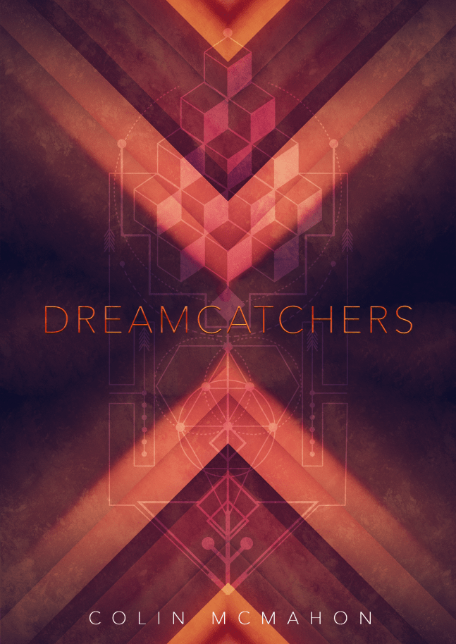
Now, before you go, enjoy one more mock-up:
Oh, and if you’re intrigued, you can pick up your own copy of The Dreamcatchers right here!

Interesting covers. Check out mine on sentientcovers.wordpress.com
LikeLike